
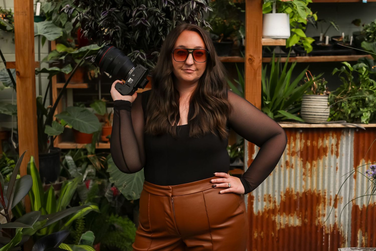
When I first started my photography business, I did what a lot of photographers do.
I looked around at what was popular, what was trending, and what successful photographers were doing. My branding was pretty. It fit in. It checked all the boxes.
But after my first year of really being in the market, something felt off.
The business felt like me.
The branding didn't.
So I started over.
And then I started over again.
There were multiple rounds of logos, colors, fonts, and designs. I even ordered business cards at one point only to realize they didn't feel right. Back to the drawing board I went.
What I didn't realize at the time was that I wasn't looking for a better logo.
I was looking for myself.

The Red
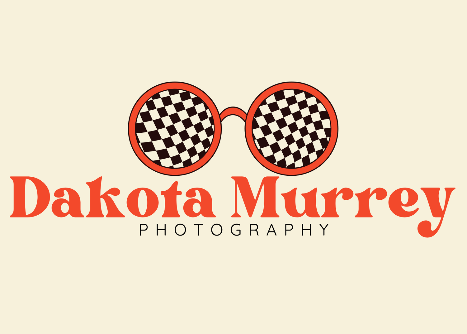
One of the most recognizable parts of my branding is the red in the sunglasses.
Most people probably assume I picked it because I liked it.
The truth is a little more personal.
That red is inspired by my husband's old Ford Ranger from high school.
The air conditioning barely worked. The paint was fading. It definitely wasn't perfect.
But it carried a lot of memories.
Late-night drives. Long conversations. The beginning of our story.
When I see that shade of red, I don't just see a color.
I see a season of life.
The Sunglasses
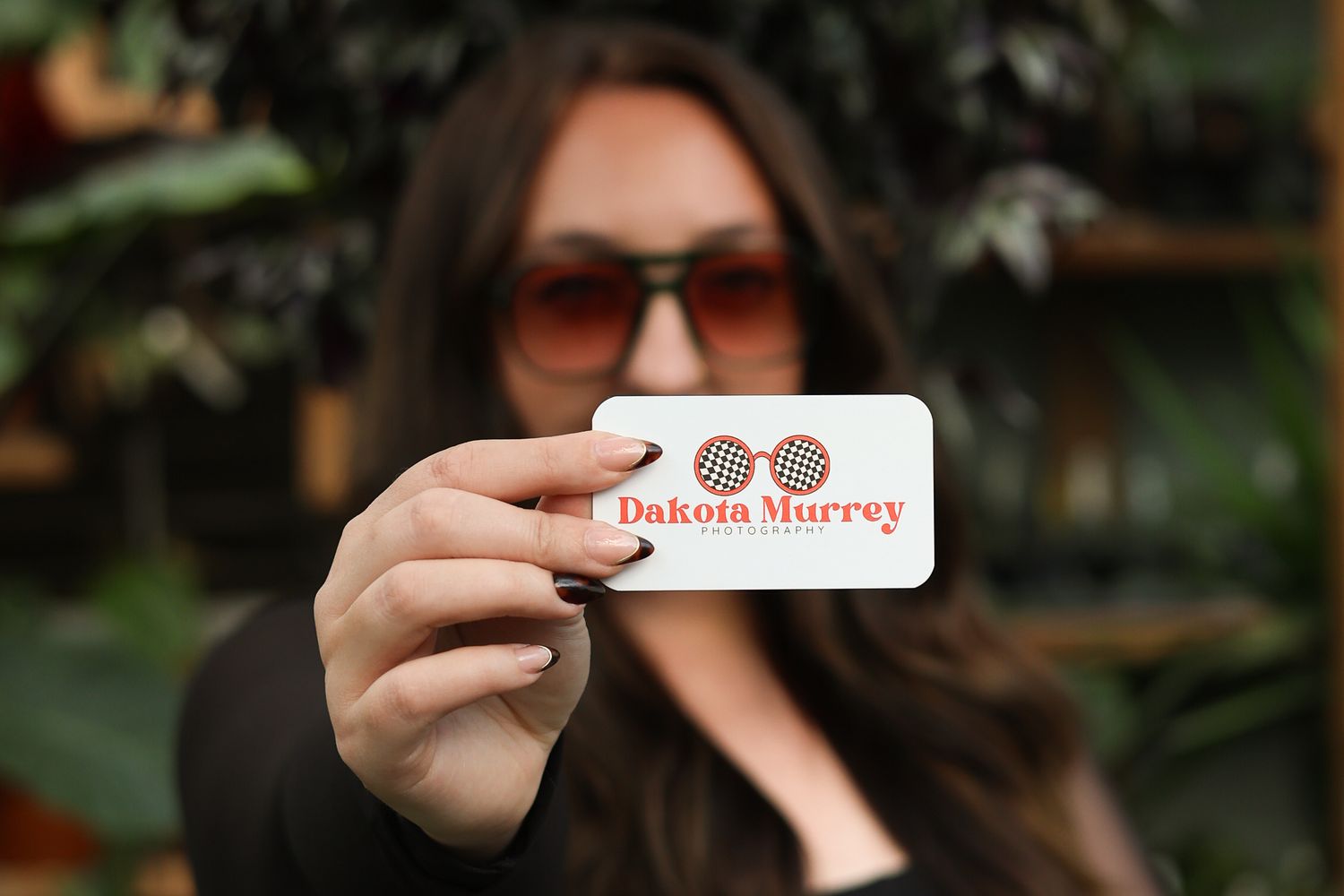
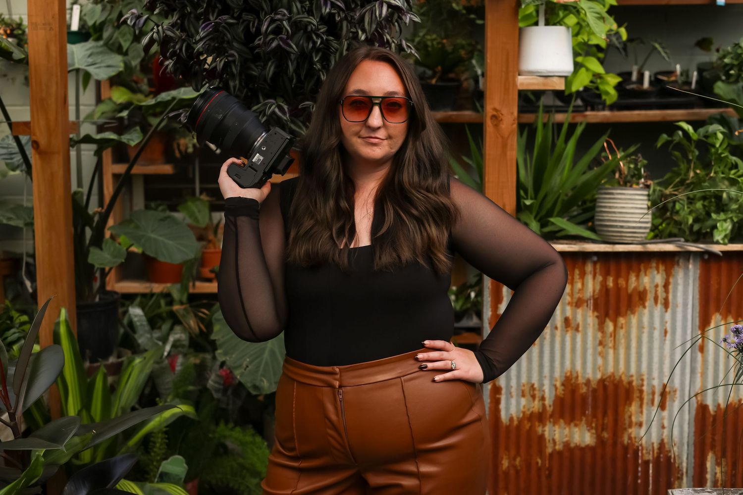
The sunglasses might be my favorite part.
Back in middle/highschool, one of my boyfriends gave me the nickname "Kodabug" because I was constantly wearing sunglasses.
Over time, that nickname stuck, and eventually that boyfriend became one of my closest friends.
Years later, when I started brainstorming branding ideas, sunglasses felt like an obvious choice.
But I wanted them to represent more than just a nickname.
So I used the shape of my daughter's sunglasses.
A small nod to where I've been and where I am now.
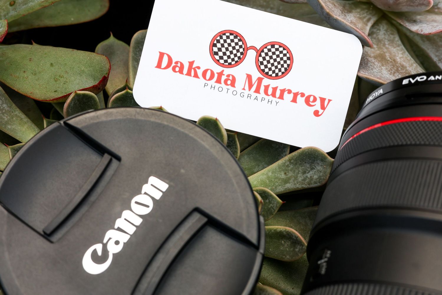
The Retro Feel
The retro style wasn't a marketing decision.
It was a personality decision.
I've always been drawn to things that feel nostalgic.
Things with character.
Things that tell stories.
The slightly vintage fonts, the warm colors, the playful feel of my branding—it all reflects the things I naturally gravitate toward in life and in photography.
When people see my brand, I want it to feel like me before they've ever met me.
Why It Matters
I tell my branding clients all the time that your brand should have meaning.
Not because every single color needs a deep backstory.
But because the strongest brands are built from something real.
Anyone can choose a trendy font.
Anyone can pick colors from Pinterest.
But nobody else has your story.
That's where the magic lives.
For me, that story includes an old Ford Ranger, a pair of sunglasses, a nickname from high school, and a daughter who changed everything.
Those details may seem small.
But together, they became a brand that finally felt like home.